Skip navigation

Category Archives: matplotlib

Today, sadly, I will be pulling down the CL-App site.  The site has been somewhat non-operational for a while now, as the IP address has been blocked by Craigslist.  I never meant for the site to be anything more than a demo project, so it was surprising that Craigslist was able to detect the activity.   Anyways, for posterity’s sake, I am going to do a quick overview of the site with some screenshots.

Disclaimer: Before Launching into the overview, i think it is worth discussing my thoughts on web scraping.  While I think scraping is a very handy tool to have, I also think it needs to be used responsibly.  If there is an API available, that should always be used instead.  I built the app for my own entertainment and education, it was a great way to learn how to stitch together a number of python libraries and frameworks into a fully functional site.  I had a long list of features and improvements that I though would be cool to implement, but in the end, because I knew Craigslist is hostile to scrapers, I felt it would be best too leave it as is and move on to other projects.

A Brief Overview

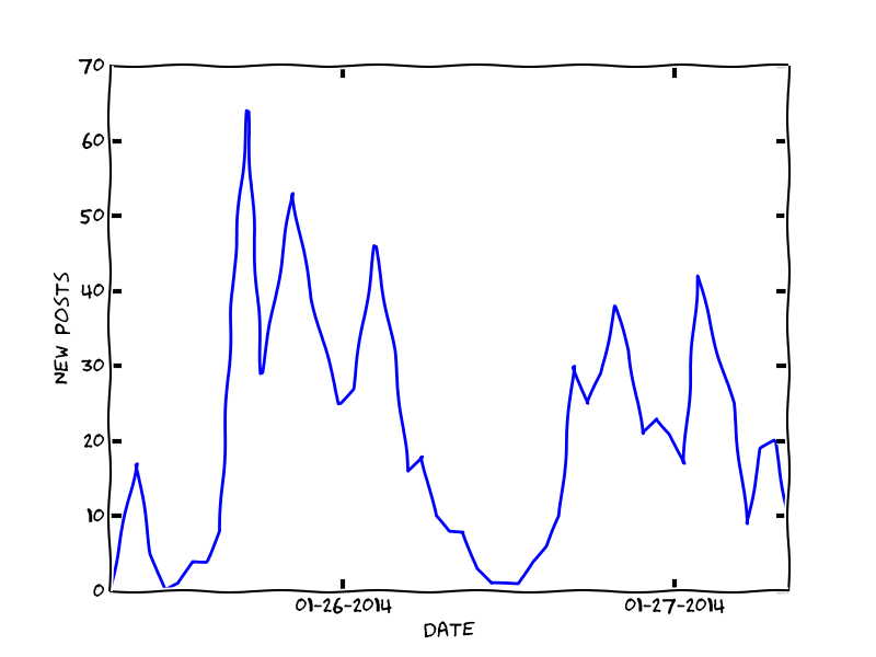
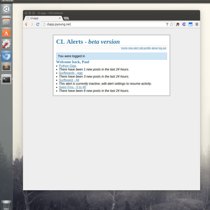
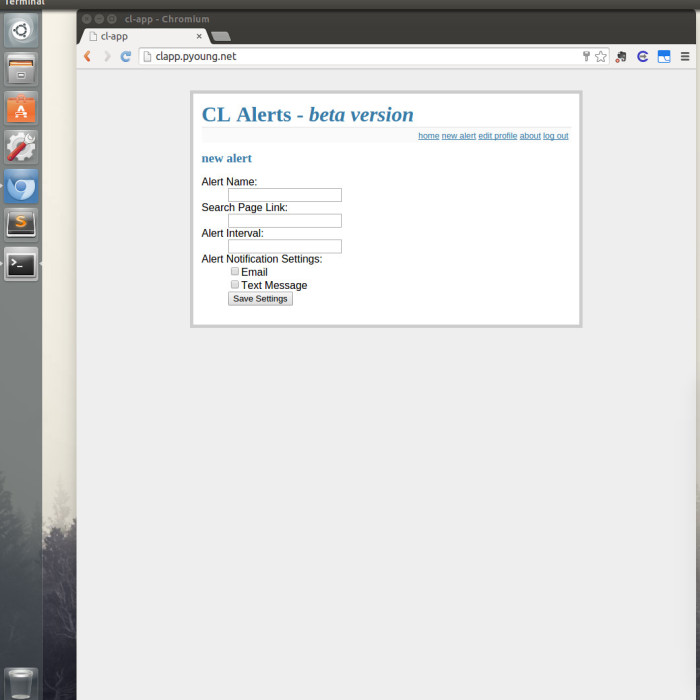
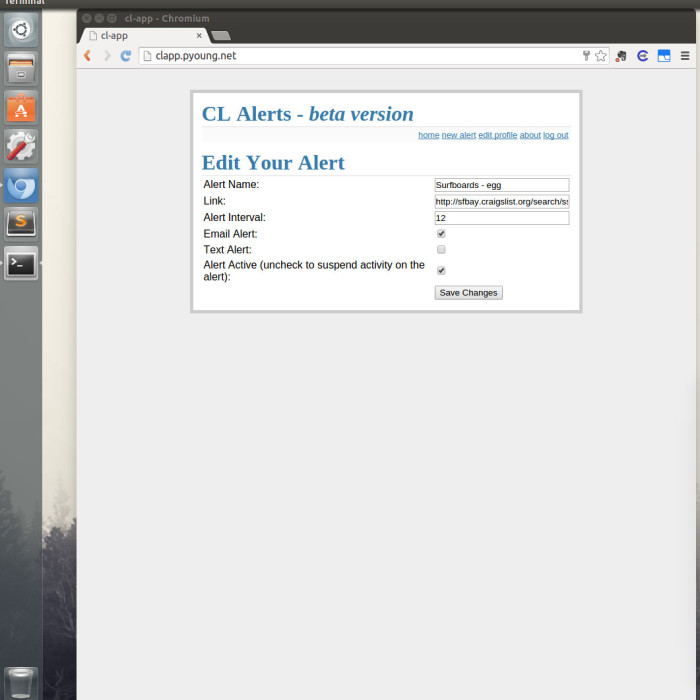
The purpose of the site was to alert users when new posts were created under a certain search criteria.  The alerts could be sent via e-mail or text message.  In order to prevent too many requests to Craigslist, the app would check for new updates once per hour, but the user could specify longer intervals between alerts if desired.  Below are some slides showing screenshots of the site.
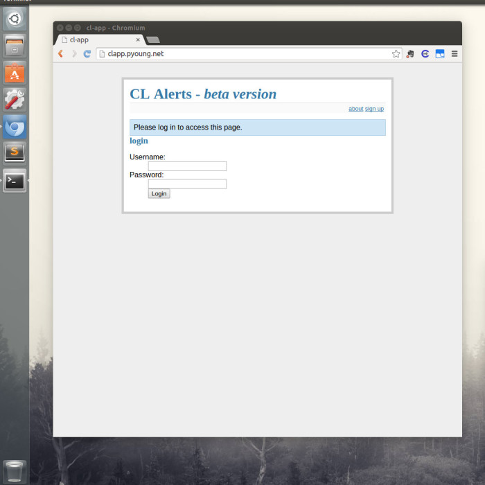
  • Login Page

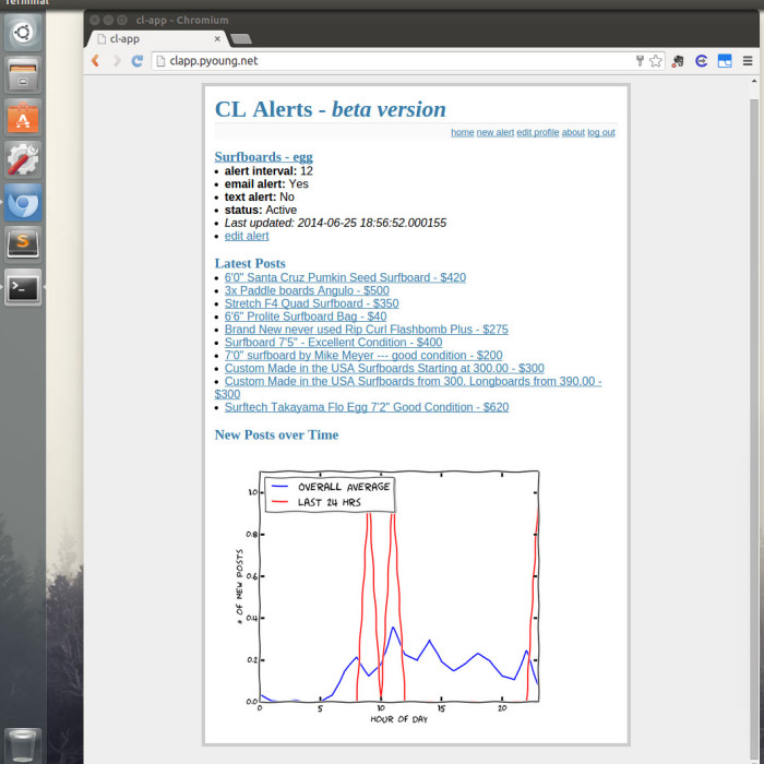
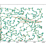
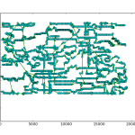
As you can see, the site was pretty bare bones.  Considering the main purpose of the app was to send alerts I didn’t feel the need to invest much time in the frontend.  I did add a feature that returned a xkcd style matplotlib plot that compared the number of new posts in the last 24 hours to the average number of new posts by hour.  Had I put more time into this project, adding some more analytics would have been fun.

If I had to rate the usefulness of this application on a scale of 1 (useless) to 10 (useful), I would give it about a 4 or 5.  I tested it out with a handful of different searches, and never found the alerts to be that useful.  Because I limited the alert interval to a minimum of an hour, this service wasn’t very useful for items that moved very quickly (i.e. free items).  In those cases, you would probably want a minimum of 15 minutes between scrapes.  I do think it would work well for someone looking for a very specific or rare item, but I never really bothered to test that hypothesis.  One feature that I found useful was that the alert status page would display the last 10 posts that fell under your search criteria.  I found that switching between my different alert status pages was a very convenient way to quickly check if there was anything interesting under any of the searches.  In essence, it was a page of bookmarks for various searches, and I found that to be pretty useful.

It should be noted that Craigslist allows you to save searches and to send e-mail alerts.  I just noticed this the other day.  You need to have an account with Craigslist and from what I can tell, you cannot control the e-mail alert too much.  I just started an alert on their site, so I can report back on that.

Anyways, that is all for now.  It was a fun project and a good learning experience, but I am glad to be putting this one away.  While I still have a few projects that involve web scraping, and I will continue to dabble with it from time to time, Craigslist is notoriously hostile to scrapers, so getting a cease and desist from them is one less thing I have to worry about.

So I decided to add a cool feature to the Craigslist Alert app that displays a plot of the number of new posts over time for a given search. This chart allows the user to get an idea of how often and at what time new posts are put up on craigslist for their particular search term, which could help the user refine their search and alert criteria in order to get better results.

Because I was already familiar with matplotlib, I figured I would generate the plots using the library and then save the plot as an image that could then be accessed by the flask app. As I was browsing through the matplotlib docs, I noticed a section on xkcd style plots. This seemed like a fun way to present the data so I set up a test script and gave it a run. As it turns out, in order to get the plot to display correctly, you may need to do a couple of things. First, you need the latest version of matplotlib (1.3), so I had to upgrade my version. Secondly, in order to get the font correct, you need to download the Humor Sans font. Finally, you may have to clear the matplotlib font cache. For linux users you can do this by typing in rm ~/.matplotlib/fontList.cache at the terminal. Once you have all of that set up you simply add plt.xkcd() to your code and you will be rewarded with xkcd style plots. Below is an example of the plots that are generated for the CL App.

Paul3

The plots get generated by a function when the viewer loads the alert status page in the web app. The function first checks if the plot exists, and then checks when the last time it was updated. If the plot is more than an hour old, or if it does not already exist, the function will create it and save it to a folder. The file path is returned and put into the html template. Overall, it was a pretty straight forward process. You can check out the code in the github repo (the plot function is in the ‘generate_plots.py’ script).

So I got around to doing an actual cython performance comparison.  As was expected, converting python code to cython results in fairly substantial performance gains.  I’ve posted the code on github, and will show the results here.  I simply took the primes example in the cython tutorial, and created a python version, and modified the cython version a little bit.  The python version is below:

def primes(kmax):
    p = [0] * kmax
    result = []
    k = 0
    n = 2
    while k < kmax:
        i = 0
        while i < k and n % p[i] != 0:
            i = i + 1
        if i == k:
            p[k] = n
            k = k + 1
            result.append(n)
        n = n + 1

    return result

For the cython version, I modified the original static array in the code to a dynamic array using malloc. This allowed me to pass in the desired length of the primes return, without having to use an upper bound exception, as is done in the original cython tutorial. This was a little frustrating, as I was not familiar with malloc, and it is a good example of why python is such a wonderful language to use (assuming you don’t have performance issues). The cython code is below:

from libc.stdlib cimport malloc, free

def primes(int kmax):
    cdef int n, k, i
    cdef int *p = <int *>malloc(kmax * sizeof(int))
    result = []
    k = 0
    n = 2
    while k < kmax:
        i = 0
        while i < k and n % p[i] != 0:
            i = i + 1
        if i == k:
            p[k] = n
            k = k + 1
            result.append(n)
        n = n + 1

    free(p)
    return result

As you can see, there is still some python code in the cython function. One of the limitations with cython, is that if I want to run the cython function from a python script, I need to return the results as a python object. Of course, I could just run everything in cython!

I created a script to time and plot the performance of the two functions over a number of input values. Here is the result:

cython_speed_test

So as you can see, the partial cython implementation vastly outperforms the python function.  This gives you an idea of what kind of overhead the python interpreter brings to the language.  So know that I have a good idea of what kind of performance gains I can get using cython, I am going to try to implement some of these in my algorithms.  From what I understand, I simply need to convert python data objects to cython data types in order to get the code to compile to C.  I think a fun future project would be to write a python script that automatically converts common python data objects to their corresponding cython counterparts.  If I get a little time in the near future I may give that a shot.

So a few days ago I showed off some results of using a line profiler package to get detailed feedback on python programs.  Using the package, I found out that my cost calculation algorithm for a Tabu Search implementation for the Traveling Salesman Problem (TSP) was the major bottleneck in my code.  After playing around with the function and reading some forums, I figured out a way to significantly improve the cost function.  I was originally computing the cost of the entire TSP path for every 2-Opt iteration.  It turns out that this was a fairly excessive calculation, as I was only swapping the positions of two nodes at a time, the resulting change to the total cost was simply the distances between the two nodes and their respective neighbors.  So I modified the function to accept the position of the two nodes, and then calculated the distance of those partial routes to identify swaps that increased the solution’s optimality.

The original code is posted below.  In this function, I pass in a list of index values that correspond to the order in which the nodes are visited and then the function computes the total distance of the path, including the return trip to the starting point.

def calc_cost(perm):
	distance = length(points[perm[-1]], points[perm[0]])
	for i in range(0, nodeCount-1):
	    distance += length(points[perm[i]], points[perm[i+1]])
	return distance

In the modified function, shown below, I pass in the same list as before, however I added another argument to the function that indicates the position of the path that I want to evaluate. The function then calculates the distance between the provided position and the node directly before and after it in the path. I call this function four times when evaluating a 2-Opt iteration, twice to evaluate the change in the two points that were swapped, and twice again to evaluate the original distance in the path.  If the total segmented distance of the two swapped points is lower than the total segmented distance of the original two points, I keep the modified solution as it will have a lower total distance.

def calc_seg_cost(perm, c):
        if c != len(perm) - 1:
            seg = [perm[c-1], perm, perm]
        else:
            seg = [perm[c-1], perm, perm[0]]
        distance = 0
        for i in range(0, len(seg)-1):
            distance += length(points[seg[i]], points[seg[i+1]])
        return distance

I ran the two different versions of the code on a number of TSP problems and recorded the time of each run using the unix time utility.  I then plotted the results using matplotlib.

time_plot

As you can see from the plot, the function modification appears to be saving a substantial amount of time.  The primary advantage of this modification is that I can run my algorithm for a higher number of iterations and get better optimatily in the 5 hour time frame that we have.  This should help me improve my scores, but I may still need to keep tweaking the algorithm if I want to get higher scores on the larger problems, as it looks like the cost function modification by itself will not be enough to achieve that goal.

So I am taking a discrete optimization class through Coursera and so far it has been pretty intense. The class uses python for it’s homework submission, so while you are free to use any language to solve the homeworks, it was easy to get up and running because python was well supported.  As I quickly found out however, the python language has a lot of overhead that slows it down considerably compared to other languages.  So I have been playing with Cython (a python package that tries to optimally compile python code to C) and have had some success with that, but will probably have to keep exploring other options as my code has been running horribly slow.

One of the recommendations from the professor was to use visualizations to help debug and improve algorithms.  I had been looking for an excuse to dive into the python plotting library matplotlib, and this seemed like a good excuse to do so. I was having trouble getting a feel for the performance of a Tabu Search implementation that I was working on for the Traveling Salesman Problems (TSP), so I decided to code something up using matplotlib to help me get a better idea of how the algorithm was working.

The TSP is a very difficult problem to optimize.  When the number of nodes gets very large, the amount of time it takes to find an optimal solution increases exponentially.  As such, it is often better to attempt to achieve sub-optimal solutions using Local Search techniques.  The downside to these algorithms, is that they rely on randomly searching for small improvements in the solution, and due to the randomness involved, it is difficult to get an idea of how your algorithm is working.  So this problem makes a fairly good candidate for developing supporting visualizations.

I took a stab at writing a simple plotting function that would plot out the nodes of the TSP problem as well as the solution path.  But I also wanted to compare the current solution with previous iterations to see how the algorithm was performing.  So I created a function that allows you to pass in as many iterations of the solutions as you like, and plots out the current solution, and overlays that on top of the older solutions in a different color.  I have used plotting libraries in R and SAS before so I figured this wouldn’t be too difficult, but as I quickly found out, and as anyone who has ever used a plotting library knows, it is pretty easy to get bogged down in documentation as each function/object has dozens of optional arguments (which is pretty standard for plotting libraries, as they need to provide the flexibility for users to create unique visualizations) and plenty of quirks.  One of the more frustrating issues that I ran into was I wanted to have arrows indicating the direction of travel to the individual nodes.  I spent a while trying to look if there was an optional line type I could use, but as I soon found out, I needed to call a special arrow object and individually draw each arrow between each point.  I was able to accomplish this with a couple of for loops, so it wasn’t a huge deal, but it definitely added to the verbosity of the code.  Anyway, the code is up on gist, here, and I have attached a few examples of the resulting output below.

There are a few things that I want to try and improve on when I get the time.  I could not find a way to lower the transparency of the arrows to represent older iterations of the solutions.  Instead, I decided to reduce the width of the red lines, however, it doesn’t seem to have a noticeable effect.  Also I wanted older iterations of the solution to have a red dashed line, but some of them appear to be solid lines.  From what I can tell, this looks like it is just an issue with the rendering.

So that’s it for today.  My next task is to play around with a line profiler to get a detailed breakdown about the performance of each line in my code.  Hopefully this will help me increase the performance of my algorithms enough to start actually getting some passing grades on the homeworks!