So I am taking a discrete optimization class through Coursera and so far it has been pretty intense. The class uses python for it’s homework submission, so while you are free to use any language to solve the homeworks, it was easy to get up and running because python was well supported. As I quickly found out however, the python language has a lot of overhead that slows it down considerably compared to other languages. So I have been playing with Cython (a python package that tries to optimally compile python code to C) and have had some success with that, but will probably have to keep exploring other options as my code has been running horribly slow.
One of the recommendations from the professor was to use visualizations to help debug and improve algorithms. I had been looking for an excuse to dive into the python plotting library matplotlib, and this seemed like a good excuse to do so. I was having trouble getting a feel for the performance of a Tabu Search implementation that I was working on for the Traveling Salesman Problems (TSP), so I decided to code something up using matplotlib to help me get a better idea of how the algorithm was working.
The TSP is a very difficult problem to optimize. When the number of nodes gets very large, the amount of time it takes to find an optimal solution increases exponentially. As such, it is often better to attempt to achieve sub-optimal solutions using Local Search techniques. The downside to these algorithms, is that they rely on randomly searching for small improvements in the solution, and due to the randomness involved, it is difficult to get an idea of how your algorithm is working. So this problem makes a fairly good candidate for developing supporting visualizations.
I took a stab at writing a simple plotting function that would plot out the nodes of the TSP problem as well as the solution path. But I also wanted to compare the current solution with previous iterations to see how the algorithm was performing. So I created a function that allows you to pass in as many iterations of the solutions as you like, and plots out the current solution, and overlays that on top of the older solutions in a different color. I have used plotting libraries in R and SAS before so I figured this wouldn’t be too difficult, but as I quickly found out, and as anyone who has ever used a plotting library knows, it is pretty easy to get bogged down in documentation as each function/object has dozens of optional arguments (which is pretty standard for plotting libraries, as they need to provide the flexibility for users to create unique visualizations) and plenty of quirks. One of the more frustrating issues that I ran into was I wanted to have arrows indicating the direction of travel to the individual nodes. I spent a while trying to look if there was an optional line type I could use, but as I soon found out, I needed to call a special arrow object and individually draw each arrow between each point. I was able to accomplish this with a couple of for loops, so it wasn’t a huge deal, but it definitely added to the verbosity of the code. Anyway, the code is up on gist, here, and I have attached a few examples of the resulting output below.
-
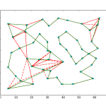
- TSP w/ 51 Nodes
-
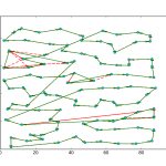
- TSP w/ 99 Nodes
-
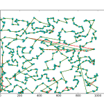
- TSP w/ 400 Nodes
-
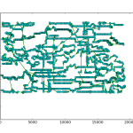
- TSP w/ 1889 Nodes
There are a few things that I want to try and improve on when I get the time. I could not find a way to lower the transparency of the arrows to represent older iterations of the solutions. Instead, I decided to reduce the width of the red lines, however, it doesn’t seem to have a noticeable effect. Also I wanted older iterations of the solution to have a red dashed line, but some of them appear to be solid lines. From what I can tell, this looks like it is just an issue with the rendering.
So that’s it for today. My next task is to play around with a line profiler to get a detailed breakdown about the performance of each line in my code. Hopefully this will help me increase the performance of my algorithms enough to start actually getting some passing grades on the homeworks!