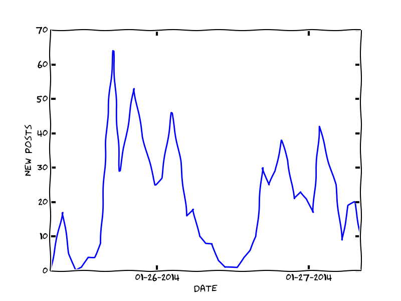
So I decided to add a cool feature to the Craigslist Alert app that displays a plot of the number of new posts over time for a given search. This chart allows the user to get an idea of how often and at what time new posts are put up on craigslist for their particular search term, which could help the user refine their search and alert criteria in order to get better results.
Because I was already familiar with matplotlib, I figured I would generate the plots using the library and then save the plot as an image that could then be accessed by the flask app. As I was browsing through the matplotlib docs, I noticed a section on xkcd style plots. This seemed like a fun way to present the data so I set up a test script and gave it a run. As it turns out, in order to get the plot to display correctly, you may need to do a couple of things. First, you need the latest version of matplotlib (1.3), so I had to upgrade my version. Secondly, in order to get the font correct, you need to download the Humor Sans font. Finally, you may have to clear the matplotlib font cache. For linux users you can do this by typing in rm ~/.matplotlib/fontList.cache at the terminal. Once you have all of that set up you simply add plt.xkcd() to your code and you will be rewarded with xkcd style plots. Below is an example of the plots that are generated for the CL App.
The plots get generated by a function when the viewer loads the alert status page in the web app. The function first checks if the plot exists, and then checks when the last time it was updated. If the plot is more than an hour old, or if it does not already exist, the function will create it and save it to a folder. The file path is returned and put into the html template. Overall, it was a pretty straight forward process. You can check out the code in the github repo (the plot function is in the ‘generate_plots.py’ script).